Code and Content for Accessibility on the platformOS Developer Portal
Diana Lakatos | November 23, 2020

We have recently finished our latest accessibility review on the platformOS Developer Portal. This article describes our approach to accessibility. As our developer portal is open source and all planning, issue tracking, and code and content contributions happen through GitHub, you can get a detailed understanding of our practices and use those insights in your own projects. (And we’d love you to share any of your accessibility learnings, too.)
Code
We address accessibility right from the design phase, where we use Figma’s Able accessibility plugin. We follow the rules for foreground and background color contrast, font size, and graphical objects (like icons, form fields, etc.) to ensure that our site conforms with WCAG AAA. The number of words or characters per line also contributes to readability. That’s why we aim to have 65-75 characters per line.
As another foundation for accessibility, we make sure to only use and correctly use semantic HTML — this helps assistive technologies (like screen readers) convey information to their users by following the semantic structure. In addition to providing and ensuring a consistent structure, semantic HTML ensures that web browsers apply default accessibility features for specific HTML elements. For example, buttons get keyboard accessibility (can be navigated to and clicked using the keyboard).
We regularly test for accessibility with various tools and ensure that the site complies with all accessibility requirements.
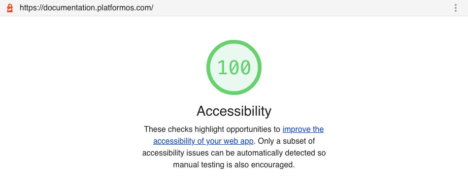
Test results of the platformOS Developer Portal:
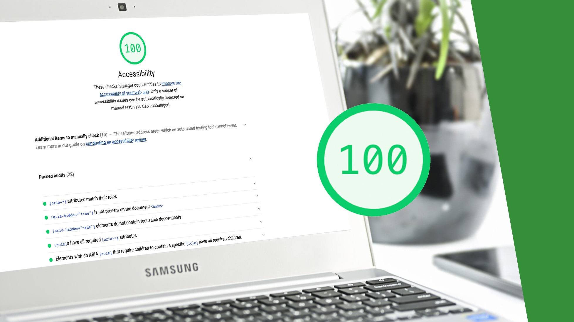
- Lighthouse: Accessibility score 100/100
- WAVE web accessibility evaluation tool
- AChecker (Web Accessibility Checker): WCAG 2.0 (Level AAA) - No known problems


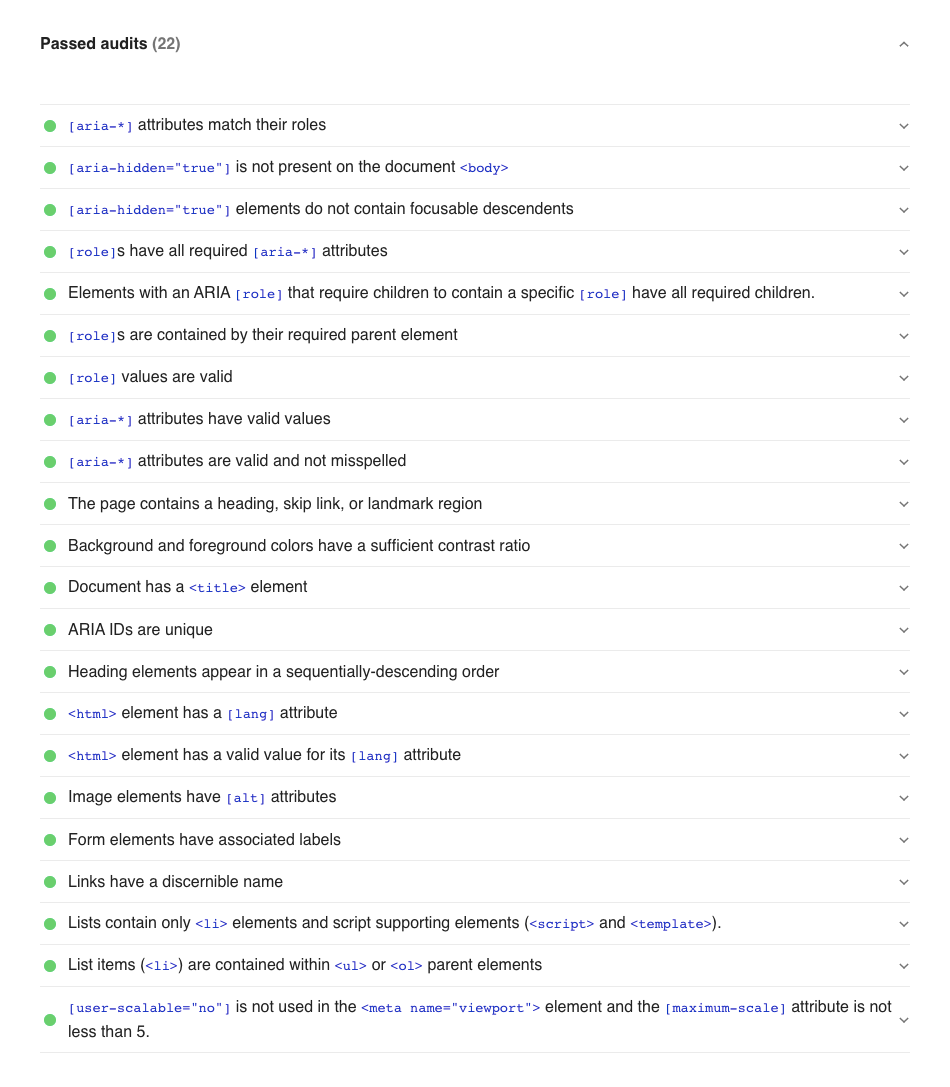
These automated accessibility checkers perform a series of audits on the site and result in a weighted average score and a list of recommendations for improving accessibility. The tests check, for example:
- the contrast ratio of the background and foreground colors
- structural elements like the title, headings, and if heading elements are in sequentially-descending order, without skipping any level
- if image elements have alt attributes
- If form elements have associated labels
- [aria-*] attributes (Accessible Rich Internet Applications (ARIA) is a set of attributes that define ways to make web content and web applications more accessible)
Find a full list of Lighthouse checks with detailed explanations of each test on web.dev.
We make sure to follow all of these technical recommendations and fix any issues we find.
Content
As semantic HTML is essential for accessibility, we make sure not to style text any other way than through Markdown, which is then translated into HTML. We provide ready-to-use templates for all content types that include all non-changeable content and placeholders with explanations for the parts to add. Placeholders provide information on the recommended format (for example, title) and any requirements or limitations (for example, the maximum number of characters). The templates define the headings structure and levels.
The technical aspects we described so far are only the foundation. To have a truly accessible site, you need to write for accessibility.
We defined the following guidelines in our Documentation Style Guide.
Guidelines for structuring content
- Use headers for structuring your content: The Markdown format you write in is translated into semantic HTML to help screen readers navigate through our content. Use headers as described in the style guide and follow the templates we provided to ensure consistency. Never skip a header level for styling reasons.
- Improve readability by using concise language, writing short paragraphs, and using lists where applicable.
- Use alternative text for images and icons. Keep in mind that screen readers read this text out loud.
- If the image serves a function as part of the documentation, describe the image in detail. Users should receive the same information from the alt text that they would receive if they saw the image.
- Include the data for charts or graphs in the alt text.
- When you use screenshots to show what the user has to do, the alt text shouldn't repeat the information already described in text.
- Decorative images don't need alt text — it would only be a distraction.
- If you insert an image, pay attention to the contrast ratio, image quality, and its size in kilobytes. The smaller the image, the more accessible it is. Better connections are rarer than bad ones.
- Provide information as text as well if you are using videos. Not everyone can use videos efficiently.
Guidelines for accessible language
Be inclusive and global. Use language that reflects your users’ diversity (including, for example, race, gender, ability, location, etc.).
- Use definitions for all terminology: Introduce new concepts by starting with a definition, and add them to the Glossary. Explain acronyms at first use.
- Use technical language: Use the most specific word you can to talk about technical concepts and processes. For example, don't say "take" when you mean "copy", don't say "put" when you mean "install", etc.
- Use gender-neutral pronouns: Avoid using gender-specific, third-person pronouns such as he, she, his, and hers. Use the second person when possible, and "they" when needed.
- Use informative link text: To help keyboard navigation, add the information into the link text. For example, instead of writing "learn more" or "click here", write the topic title.
- Avoid ableist language: Don't use words that assume an ability the user might not have (for example, "as you can see" implies the user has a capacity for vision). Avoid directional language, for example, "blue button" or "button below the headline".
- Don't perpetuate racism, bias, and harm: Replace terms like "blacklist" and "whitelist" with terms like "allowed" or "blocked". Replace "native" with "built-in". Note: If the application you describe includes these terms, you have to use them in the documentation for clarity and consistency.
- Avoid metaphors and colloquialisms.
We thought it might be helpful to show some examples of these guidelines in action from our latest accessibility edits. One of the larger tasks was to replace the word “see”, and for this we examined each instance of “see” in our documentation and replaced it with a more fitting, accessible alternative. For example:
| Instead of: | We now have: |
|---|---|
| There is a point in troubleshooting when you just can’t see new approaches anymore. | There is a point in troubleshooting when you just can’t think of new approaches anymore. |
| You should see that the background color of the page has changed to the color specified in the `app.css` file. | The background color of the page has changed to the color specified in the `app.css` file. |
| You can also use the `admin_third_party_integrations` query to see the current configuration of any third party integration. | You can also use the `admin_third_party_integrations` query to learn about the current configuration of any third party integration. |
| After setting up domain authentication, your recipients will no longer see the “via sendgrid.net” message on your emails. | After setting up domain authentication, your emails will not include the “via sendgrid.net” message. |
| In the Audience ID section, you see a string of letters and numbers. | In the Audience ID section, you find a string of letters and numbers. |
| Let's use the example to see exactly what is happening at each stage of the Model Schema definition life cycle. | Let's use the example to follow exactly what is happening at each stage of the Model Schema definition life cycle. |
| It helps to turn off word-wrap in your editor to see those patterns easier. | It helps to turn off word-wrap in your editor to recognize those patterns easier. |
You can find all the changes we made during our latest review in pull requests collected on our ticket in GitHub.
We found that these changes not only made our content more accessible but clearer and more precise.
Resources
We close this article with a collection of resources that we found helpful in making our developer portal more accessible.
- 18F Accessibility Guide with further links to resources
- Accessibility tips for web developers by Addy Osmani
- Web.dev Accessibility Scoring
- Moving beyond empathy: a11y in documentation by Alexandra White
- Don't Say Simply by Jim Fisher
We are continuously working to make our documentation more accessible and usable to the widest possible audience. Please let us know if you have any suggestions for improving accessibility. Thank you!
Interested in knowing more about partnering with platformOS?
Ensure your project’s success with the power of platformOS.