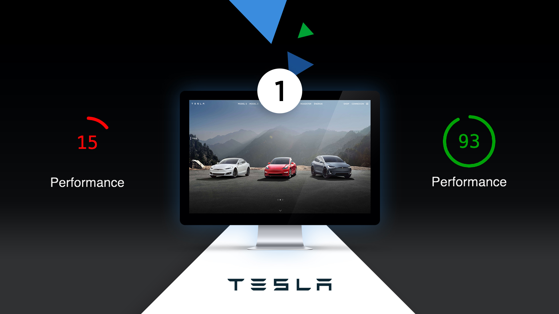


I like Tesla. I think they are a great company, working towards a better future. That's why I was on their website recently, on a pretty average connection, and I noticed that it is loading very slowly. So of course, me being me, I opened Firefox dev tools and started digging around.
TLDR: At the end of the day I managed to speed up homepage time to interactive from over 17 seconds to around 4 seconds by removing unnecessary things and optimizing assets delivery.
This two-part article series is meant to show a real-world use case of how you can:
Those are the easiest techniques, that don't involve rewriting the code or changing any functionality of the page, which is what this audit/article is supposed to demonstrate.
After running webpagetest and Lighthouse on the site, I identified the following problems:
We won't tackle some of those problems, because the nature of JavaScript is too complicated and I don't know this website well enough to decide which script can or cannot be loaded on demand. This is a task for Tesla developers, I can only help their decisions with my advice.
I did the following to speed up the site:
I made some baseline measurements using webpagetest.org (https://webpagetest.org/result/200514_GH_22675a135a6689badd0ba1bad7cf2744/) and Lighthouse:
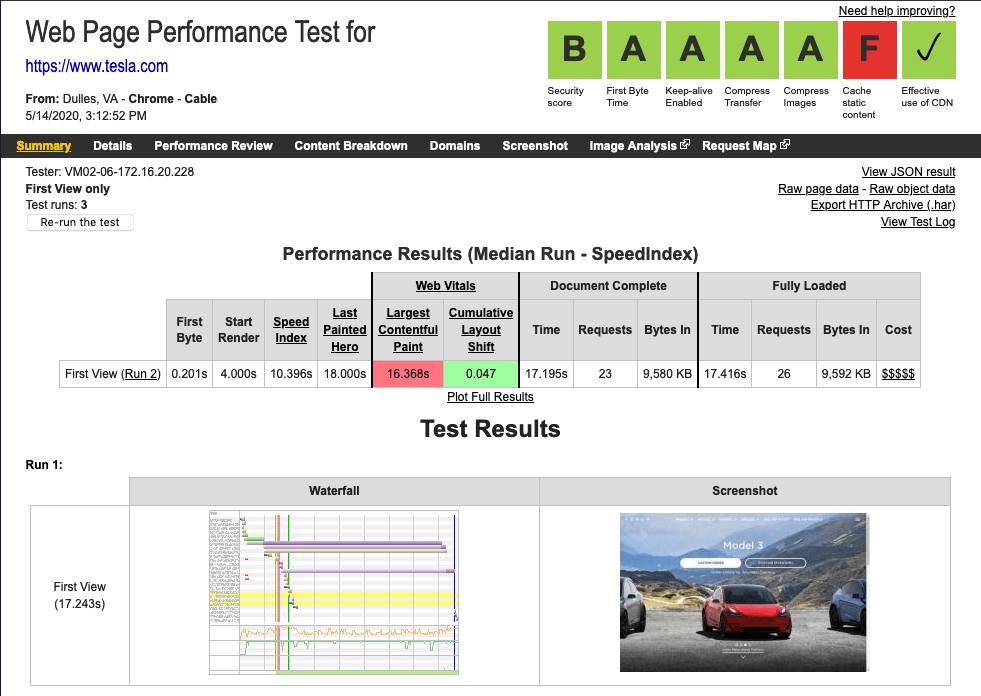
In webpagetest, the most significant thing is Largest Contentful Paint. This means that this 7 MB hero image was loaded after 16 seconds.
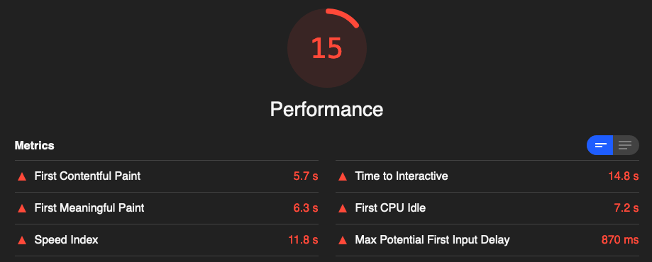
In the Lighthouse test, I like to pay special attention to Time to interactive, and First CPU Idle - this indicates when the user can start using your page (meaning, JavaScript is not blocking the main thread anymore).
Let's address the first issue first because it is the lowest hanging fruit of the bunch and does not require any technical knowledge. As I wrote in my article Optimizing Images for the Web you can basically tell which format should be used for an image by the contents of it. In this case, it should be JPEG and I'm going to use MacOS Preview to save it as a JPEG and then compress it using ImageOptim.
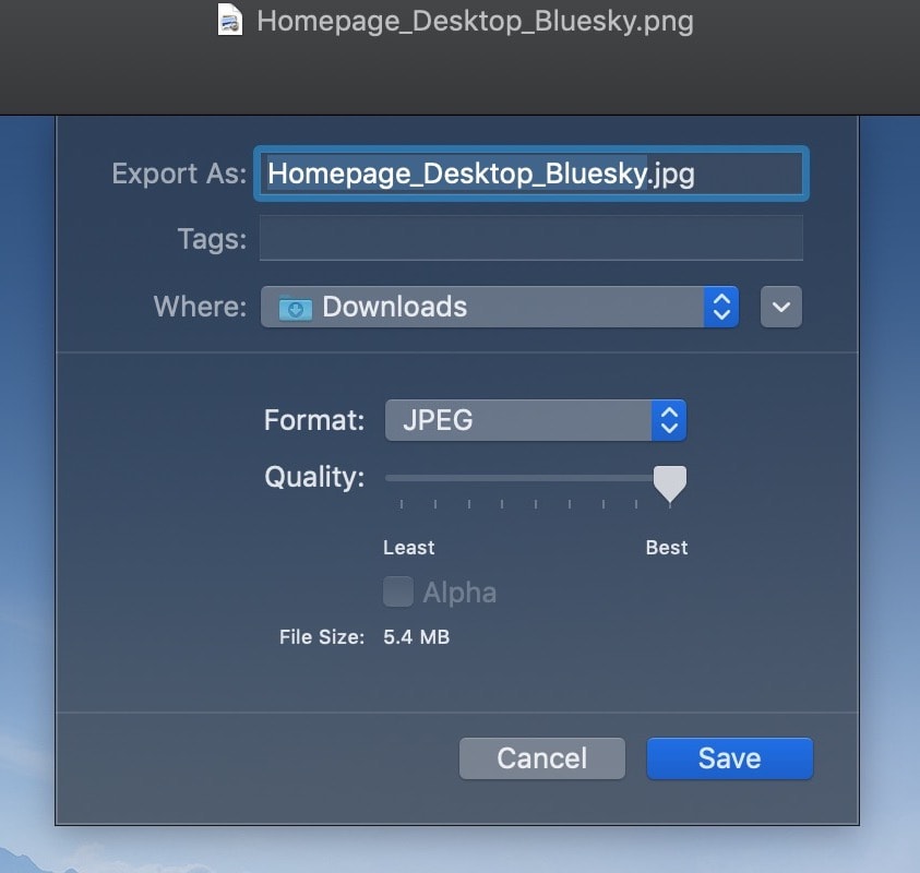
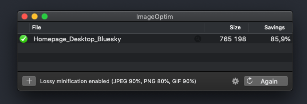
To make sure that I'm not going to degrade the quality of the image (it is a product page, so it has to look good) I used quality >90, which produces minimal artifacts. Results are pretty good, saving over 7 MB on that one image. Additionally, JPEG is progressive, so it will load in a much more pleasant way than PNG.
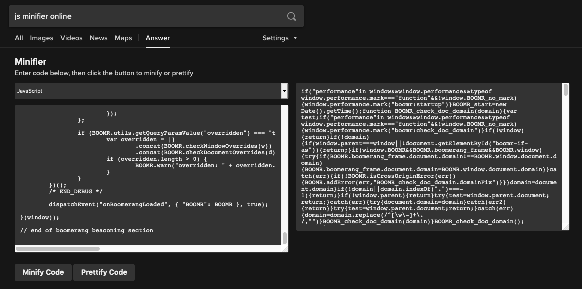
This is also a simple task to do, just take the contents of the file and paste it into a JavaScript minifier. If you use the DuckDuckGo search engine, just type: "js minifier online" and it will pop right up. Minification made the file smaller by 80 KB, 120 KB → 40 KB. Not bad for 20 seconds of work.
I noticed that the book-override.font.css file had inlined some Gotham fonts, but never used them. I removed the reference to them from the HTML file altogether.
As a result of those operations, the site got lighter by around 7 MB without any advanced techniques.
Let's see what Lighthouse says about it (after it has been uploaded to platformOS as hosting):
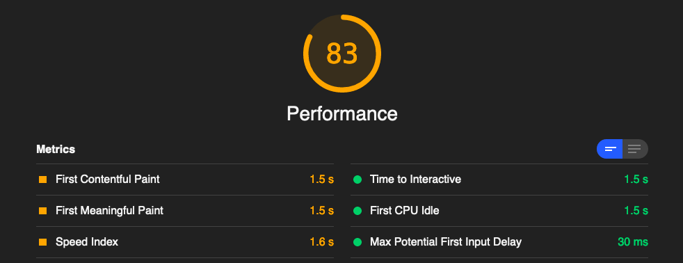
A little bit better. Let's hope the next steps will improve it further.
In part two of this series, we will take a look at the huge (2.5 MB!) CSS file and cut it down to 365 KB.
Since I started writing this article, Tesla.com did exactly what I described here in regards to images, and even used more aggressive compression, so their image is 370 KB, which means there was no need to have it in such a good quality after all. :)
You can see the results and source code here:
Part 1: https://github.com/pavelloz/tesla.com - https://tesla.prod01.oregon.platform-os.com/part-1
Part 2: https://github.com/pavelloz/tesla.com/tree/part-2 - https://tesla.prod01.oregon.platform-os.com/part-2/ and https://tesla.prod01.oregon.platform-os.com/part-2-de/
Ensure your project’s success with the power of platformOS.